.svg)
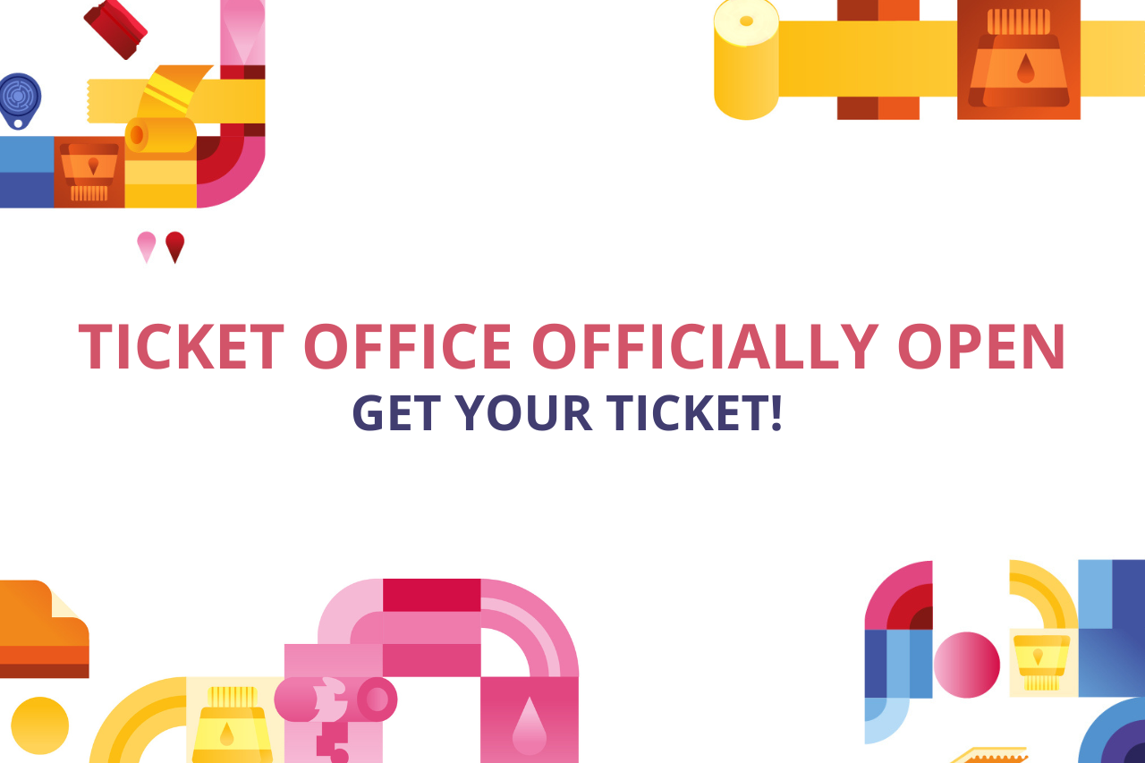
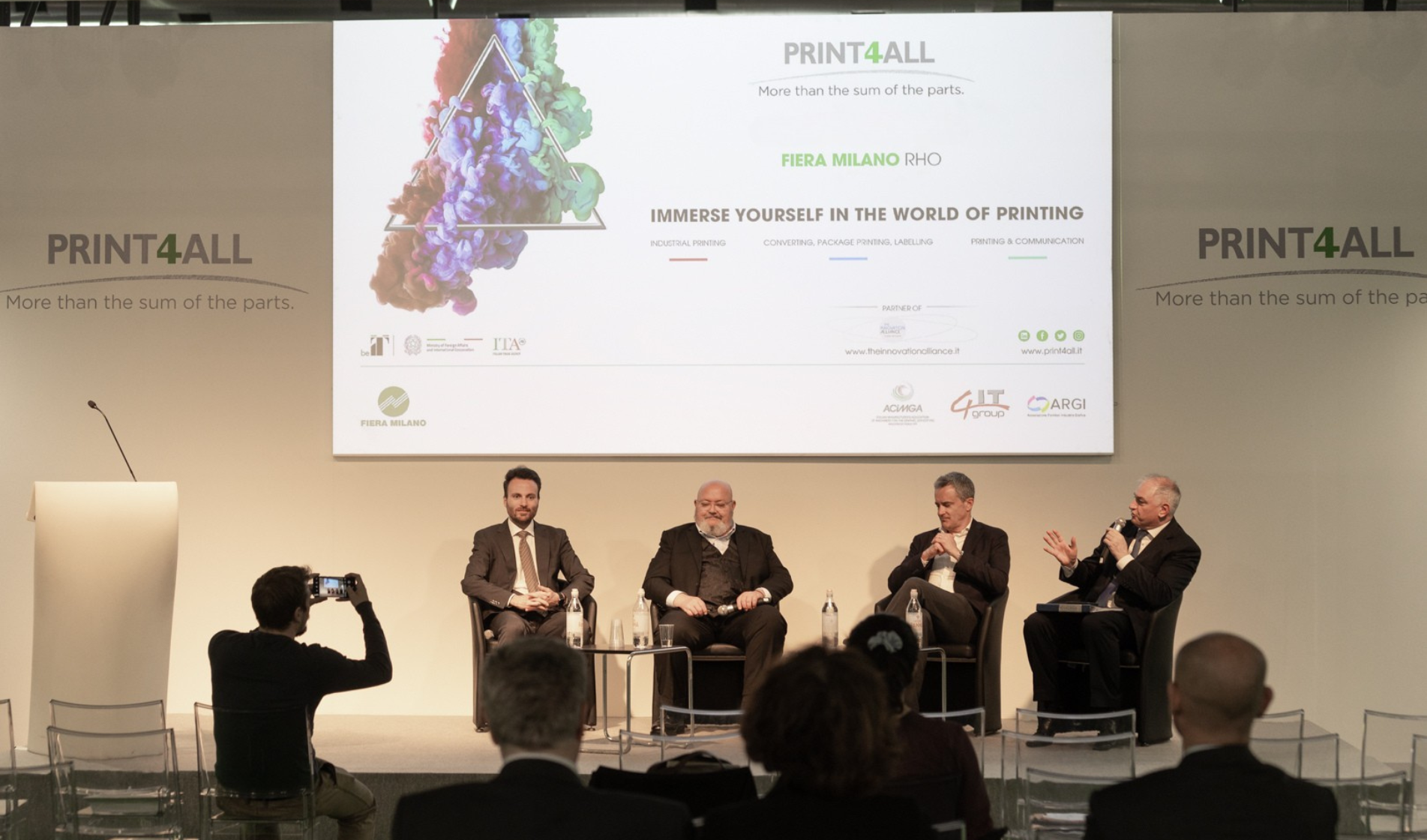
THE TICKET OFFICE IS OPEN! GET READY FOR PRINT4ALL: REGISTRATIONS ARE OPEN
The exhibition opens in a few weeks. Secure your ticket and visit Print4All and the other events of The Innovation Alliance.
GET YOUR TICKET
THE TICKET OFFICE IS OPEN! GET READY FOR PRINT4ALL: REGISTRATIONS ARE OPEN
The exhibition opens in a few weeks. Secure your ticket and visit Print4All and the other events of The Innovation Alliance.
GET YOUR TICKET GET YOUR TICKET
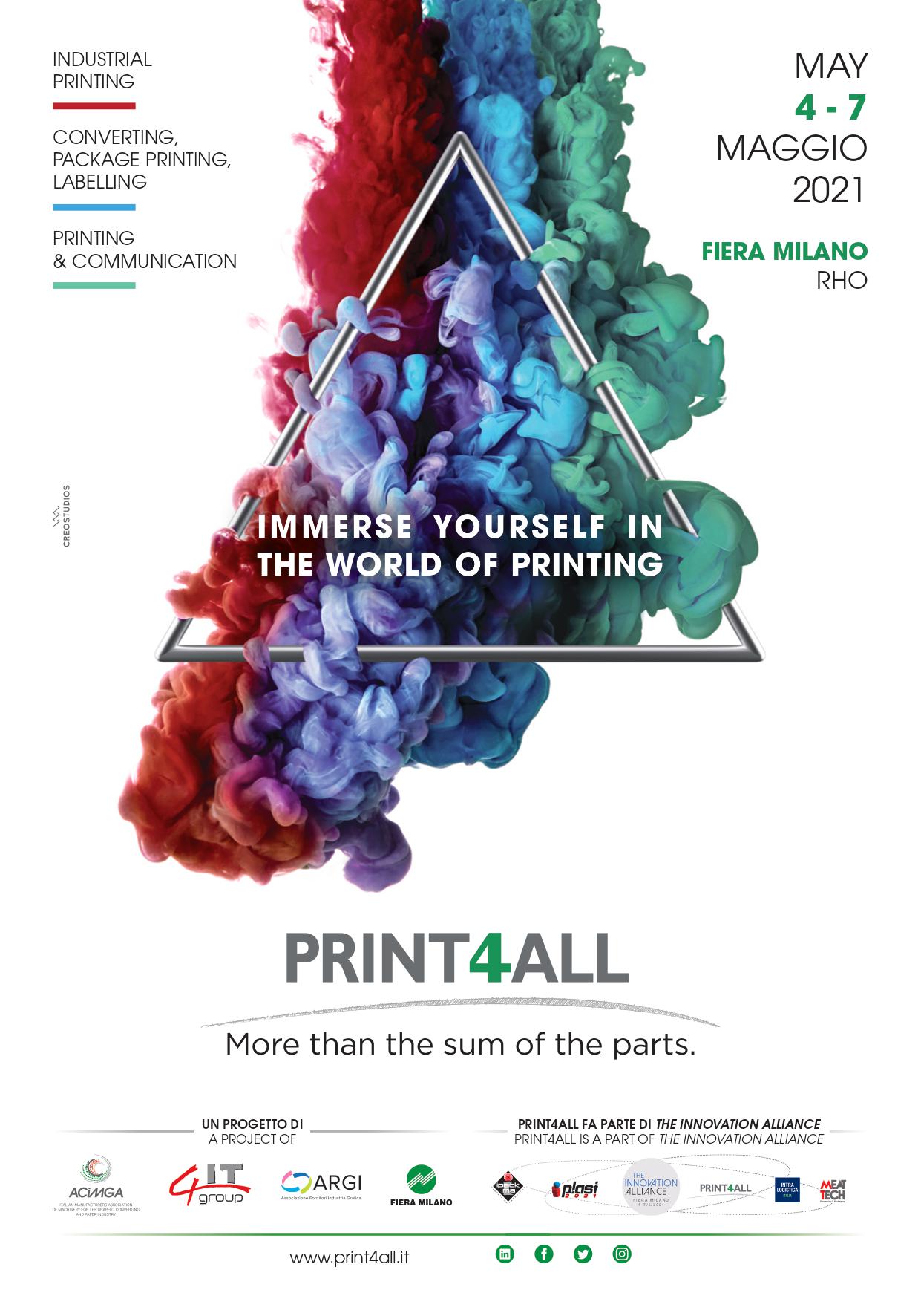
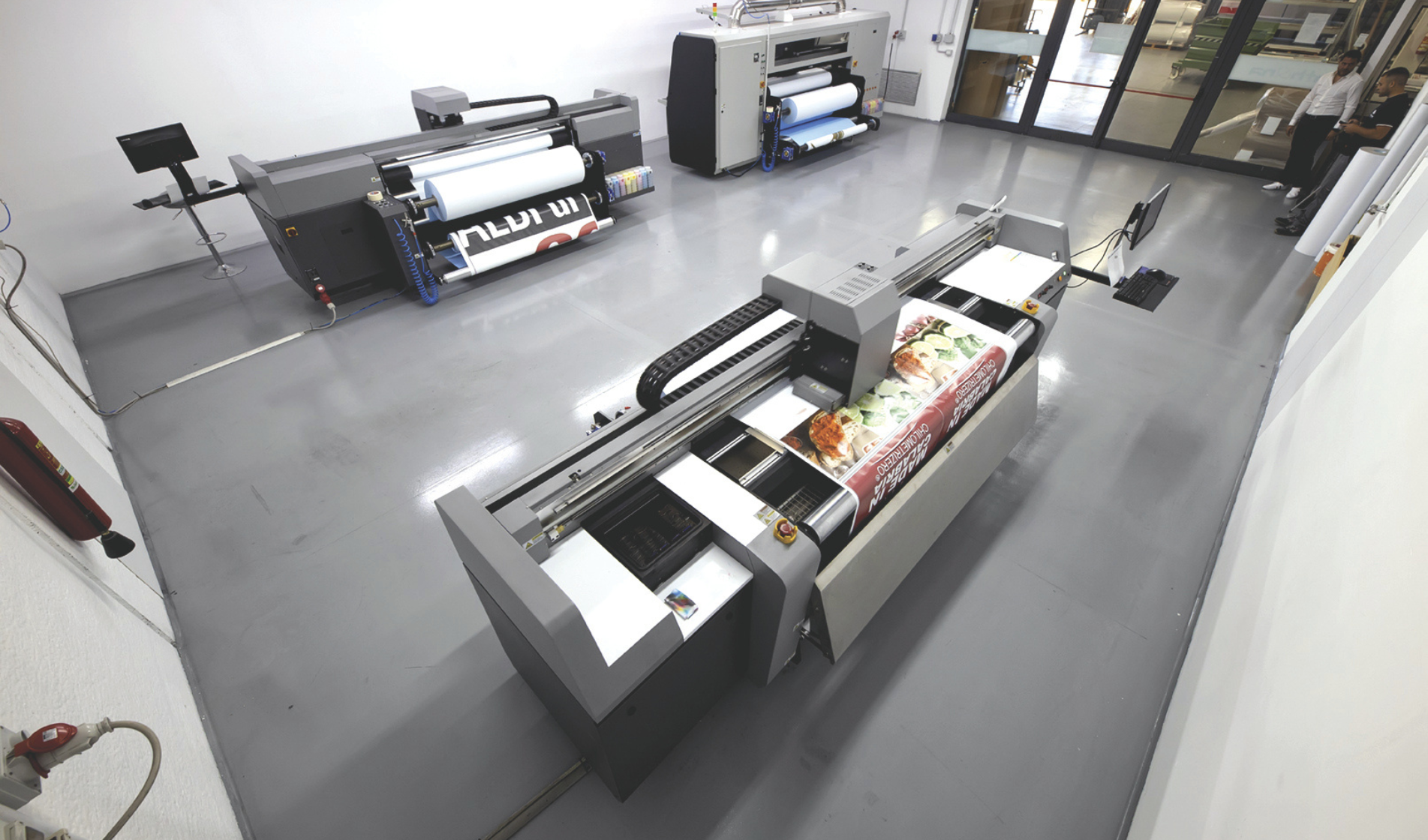
Clouds of colour move, expand in space and fill with awe. Multicoloured jets mix and mingle, generating ever new nuances to become a single soft and enveloping shape. At the centre is a thin, harmonious and stable triangle, which hints to the creativity that has characterised the event since 2018 and surpasses it to inaugurate a more open, dynamic vision.
The image and claim of Print4All 2021, created by Creostudios, spring from a very precise rational. The explosion of colour represents the countless potentials of printing into which all the players in the community are invited to dive, while the predominance of green, blue and red references the three macro-markets of the exhibition blending in seamless harmony. Art has always sought perfection and uniqueness of nature and today, by exploiting inventive technologies, innovative solutions and new materials, printing is aiming at ever higher results with the goal of recreating unique effects of light and shadow.
The new image represents the universal language that Print4All will communicate from now until 2021 through the advertising campaign on Italian and international magazines, with promotional tools and in the presence of desks at events targeting the printing community.
The full immersion will involve all sector operators and will drum up enthusiasm for the big event scheduled in two years' time at Fiera Milano.